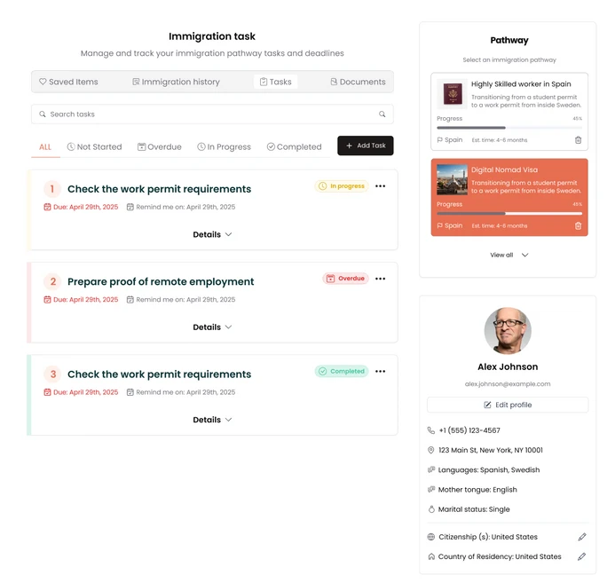
Task cards didn't say what to do next.
"After I select the checkbox, what should I do?"Usability test, task list
"I don't understand what the Link button is."Usability test, task list
Emigreat, Nov 2024 to Jul 2025
Emigreat helps people and companies get through immigration paperwork. I joined as digital product designer when the product was live and shipping weekly, with flows and patterns scattered across three roles. Nine months later: one user flow, one design system, six flows tested with real immigrants.
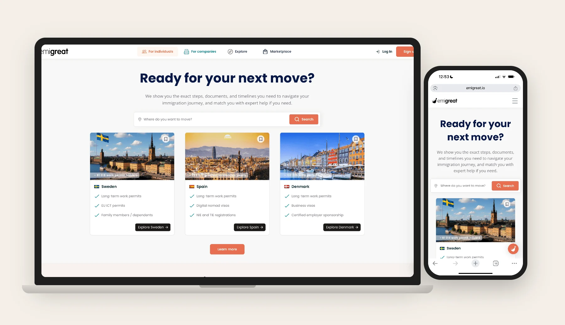
The platform worked. It was hard to say where a task started, what "Pathway" meant, or which button did what. That is what I stepped into.
A first quick usability round, then a full study with eight immigrants across six flows. Four things kept coming back.
"After I select the checkbox, what should I do?"Usability test, task list
"I don't understand what the Link button is."Usability test, task list
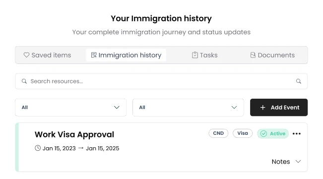
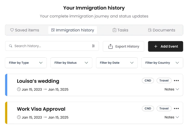
"Ohh, I didn't realize these were filters. I thought it was a list."Wireframe test, immigration history
Most people never touched the "All" dropdowns until prompted.
Testers couldn't connect the word to their own tasks, and several said the side panel felt disconnected from the list it controlled.
Top requested features, in order: expert consultation, an eligibility check, priority support, an immigration timeline, reminders.
Live, growing, and hard to explain to a newcomer.
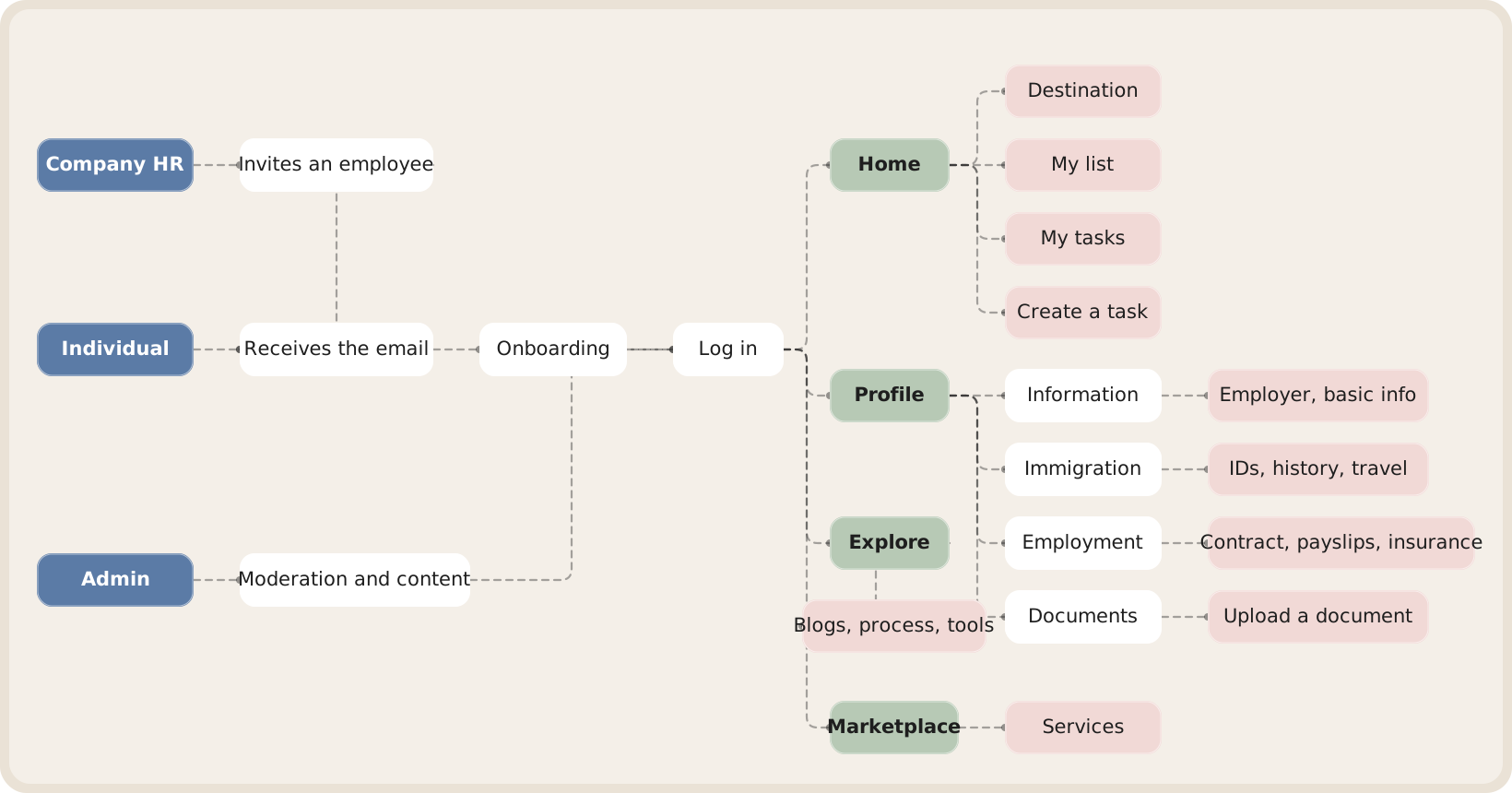
The full flow is below, with a filter per role.
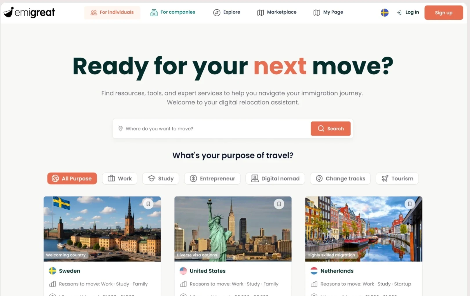
The draft and the rebuild are compared further down.
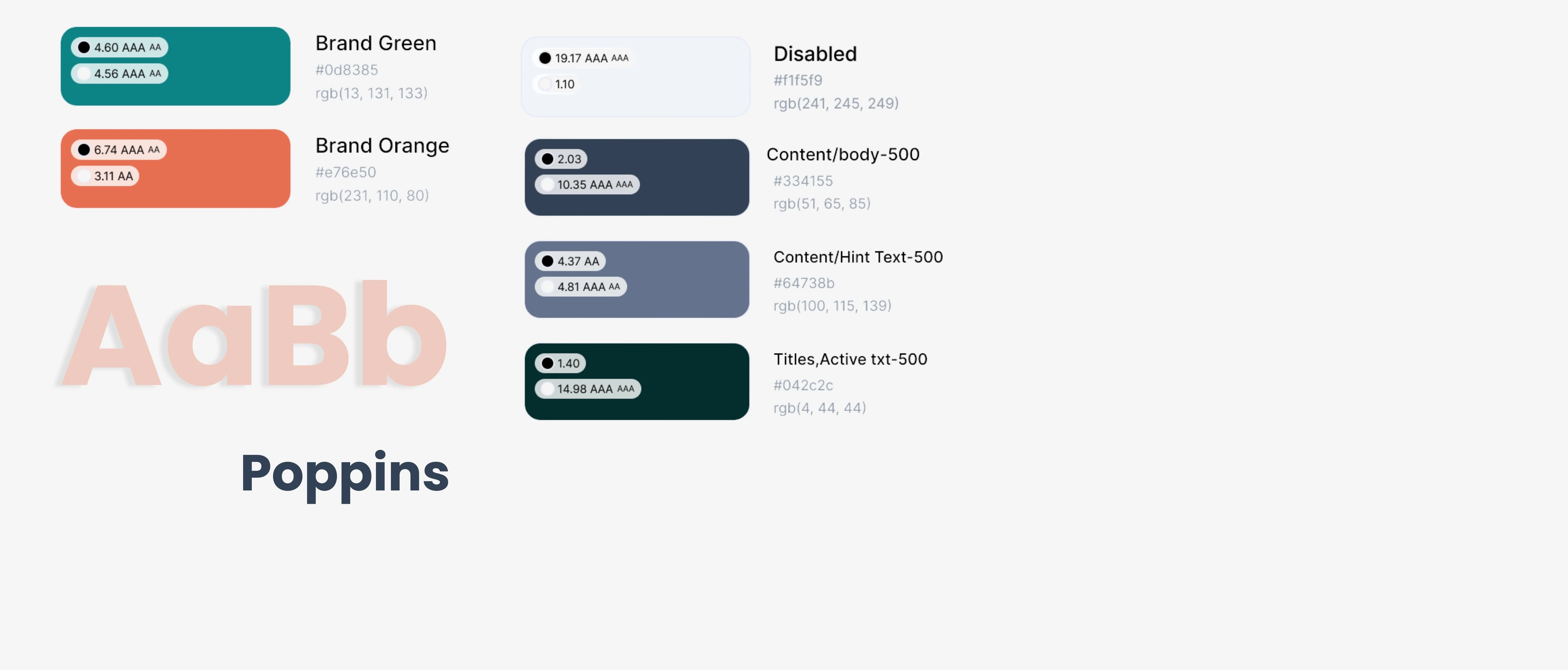
Every color pair checked before handoff. The live version is below.
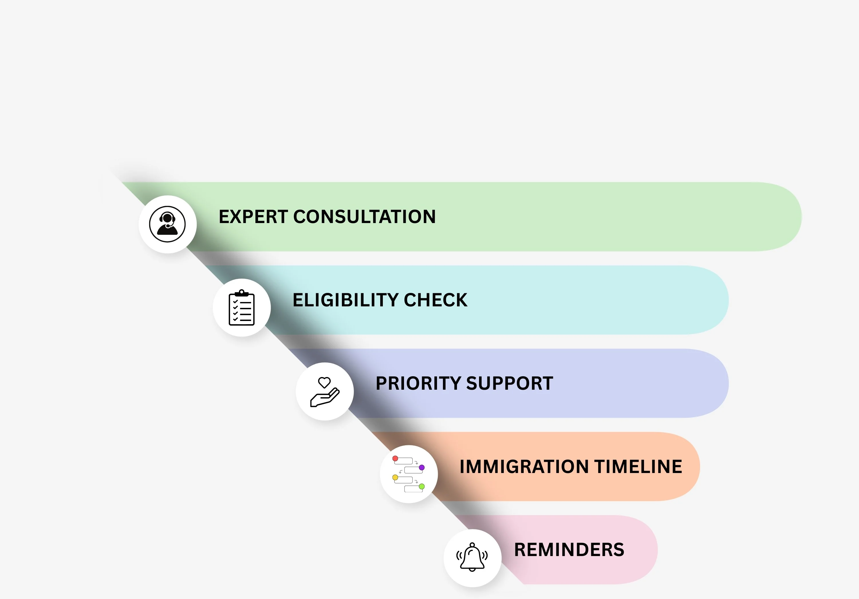
What they asked for, in order: expert consultation, eligibility check, priority support, timeline, reminders.
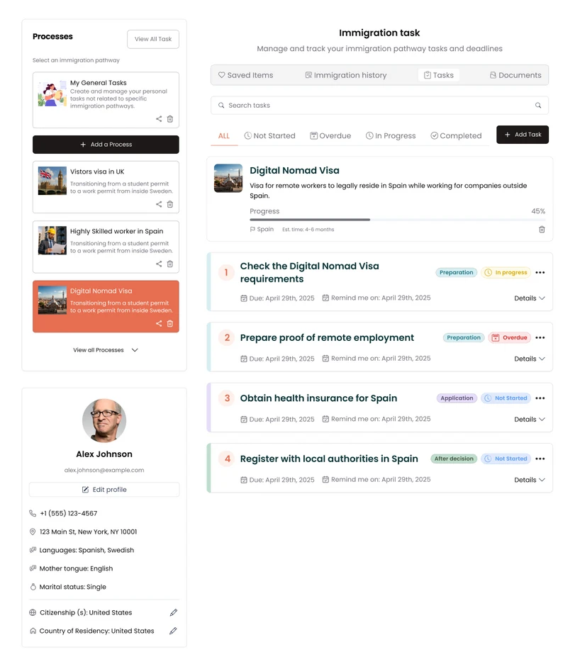
Three of the fixes are shown below, before and after.
The user flow, redrawn from my original map. Tap a role to follow its path.
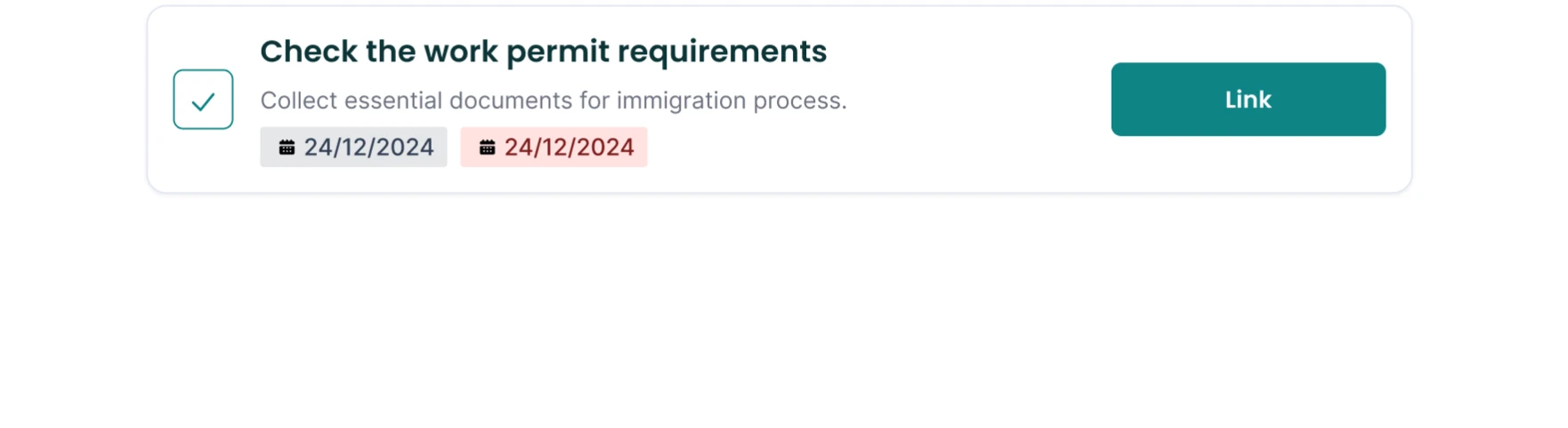
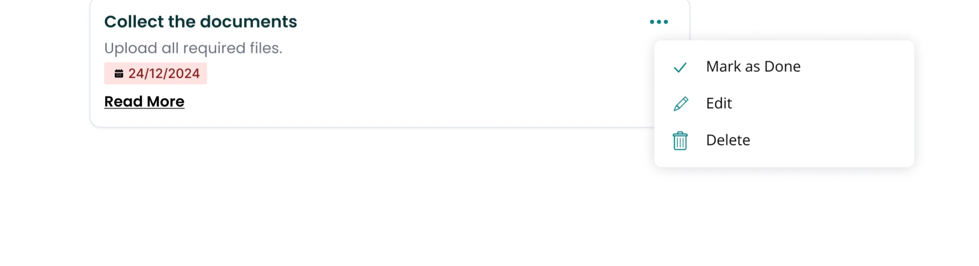

Poppins, 400 and 600. Titles in #042c2c, body in #334155.
Ratios computed from the hex values above (WCAG 2.1). Rebuilt here in code from my Figma library.
Every screen shipped with documentation and I reviewed the live build against the designs. The task cards, filters and process pages above are in the product. No adoption numbers to share: the company has since paused new services.
What I'd change: build the design system in month one, not month three. In a startup that ships weekly, it is what makes speed survivable.