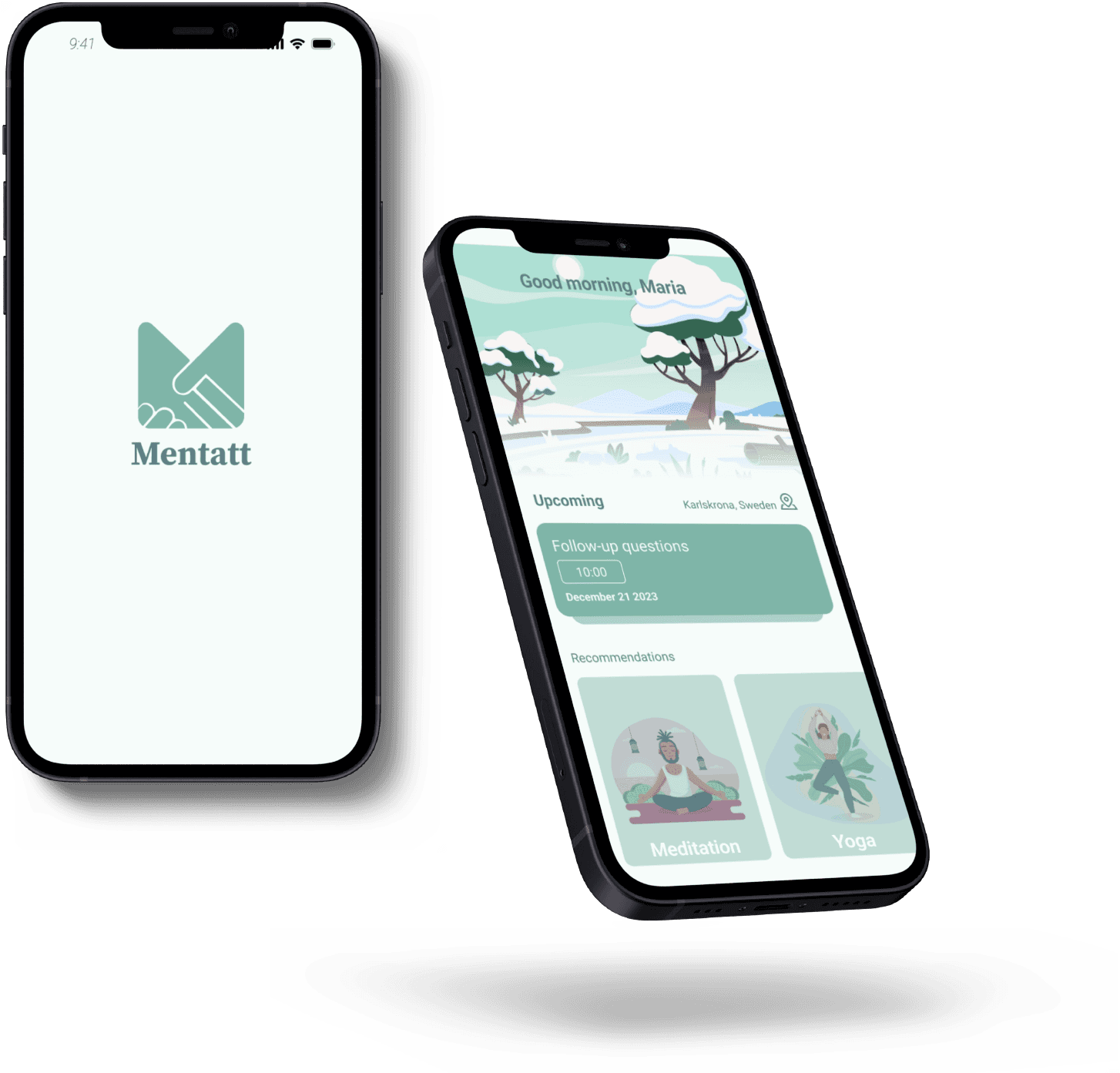
Mentatt is an application focusing on tracking early stages of mental health issues in students.
My Role: UX Researcher, UI Designer
Team: 5 UX Designer, 2 member of Mentatt
Tools: Figma, Figjam, Miro
Duration: 6 Nov 2023 – 15 Dec 2023 (5weeks )
Mentatt, a startup tracking early mental health issues in students, wants us to build an app from scratch. This includes conducting qualitative research to understand user preferences, designing an intuitive user flow, creating prototypes, and testing to meet user expectations.
What did Mentatt need help with?
Mentatt already had a basic application design that was not engaging and lacked user-friendliness. They wanted to make it more appealing, user-friendly, and engaging so that all students would want to use it.
Project Overview
Desk Research
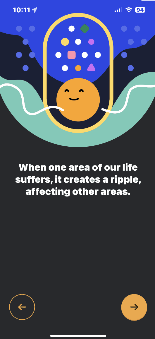
In the beginning, we wanted to conduct desk research and look for similar applications. We studied their functionality and UI to form initial assumptions before proceeding with further research.
Competitor Analysis
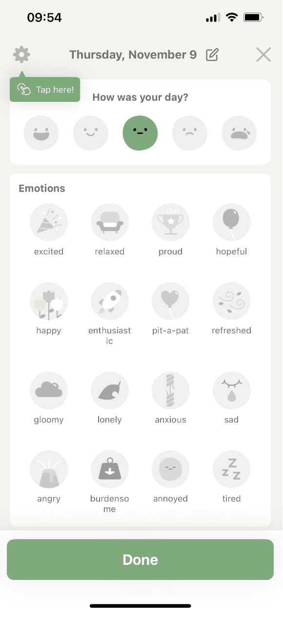
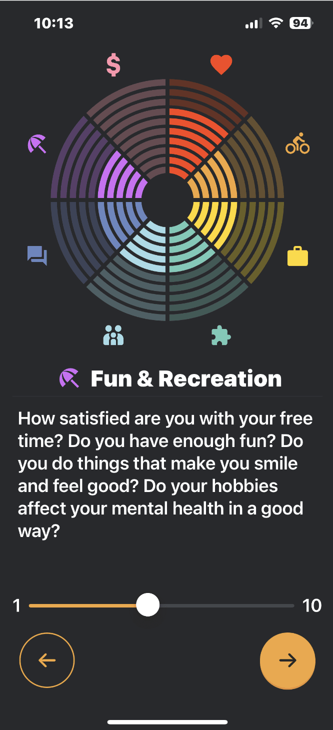
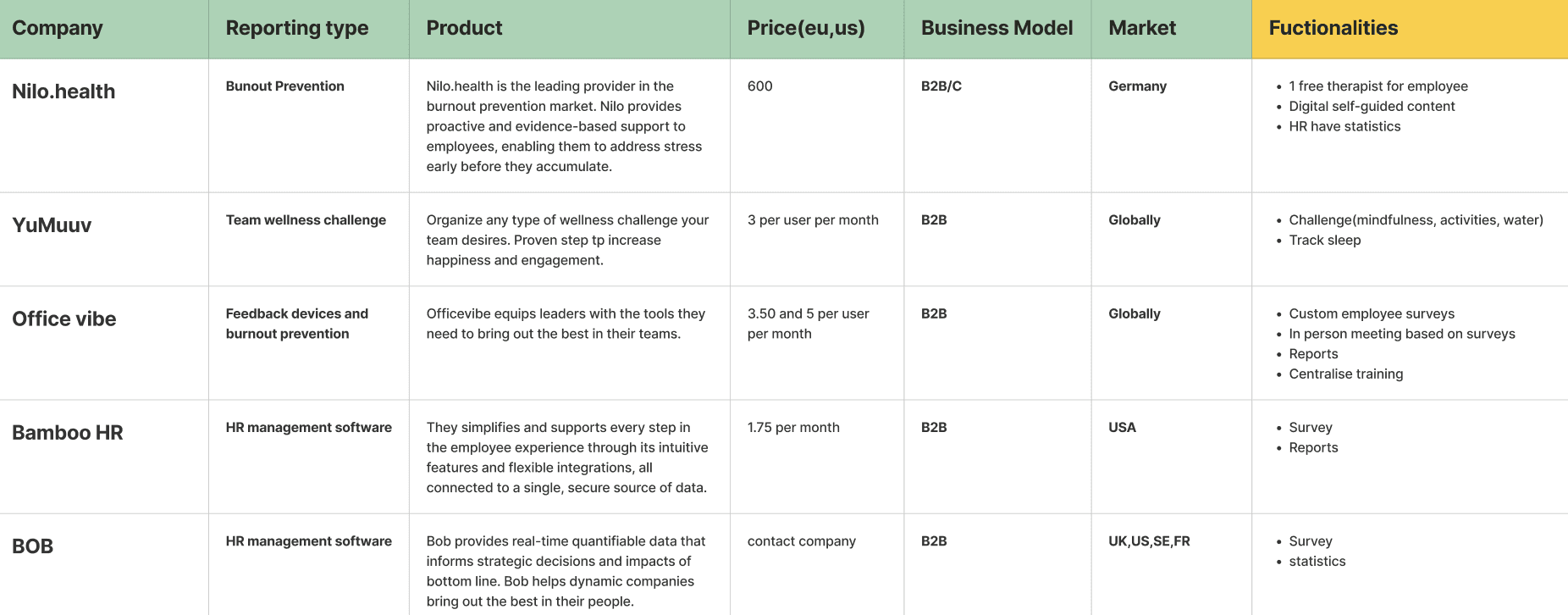
Mentatt provided us with several competitor websites, mostly from HR companies. After analyzing their features and functionalities, we noticed that many had monthly surveys and educational content, which align with Mentatt's business goals. So, we decided to add these features to the app to provide users with valuable information.
Qualitative Research
Why qualitative research?
We wanted to ask students if they use the app, answer monthly surveys, track their mental health in other apps, and if they would prefer weekly surveys
(as Mentatt offer) and the ideal number of questions.
8 Interviews
Gender: Male and Female
Age: 20 to 38
Occupation: Students
Nationality: Swedish, Brazilian, Canadian
Key Findings
From our interviews, we discovered many valuable key findings that guided us in the app development process:
1. Users don’t like more than 1 survey per month and
long surveys (more than 10 questions) .
Therefore, we manage the number of questions to avoid creating overwhelming surveys and remove weekly surveys.
2. Users want to have information to learn more about mental health.
This aligns with Mentatt's goals of giving users something engaging within the app.
3. Users do not want to see results that resemble a stock market.
The way Mentatt displayed user results wasn't engaging, so users want something more appealing and interactive.
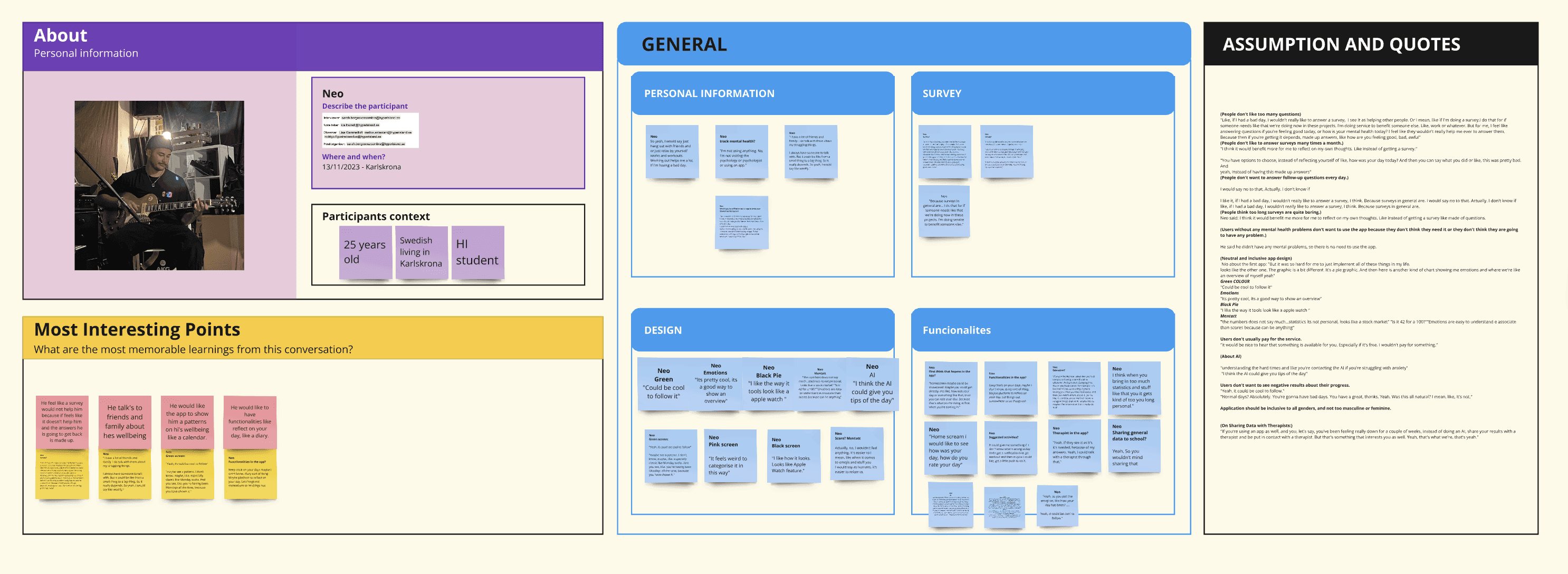
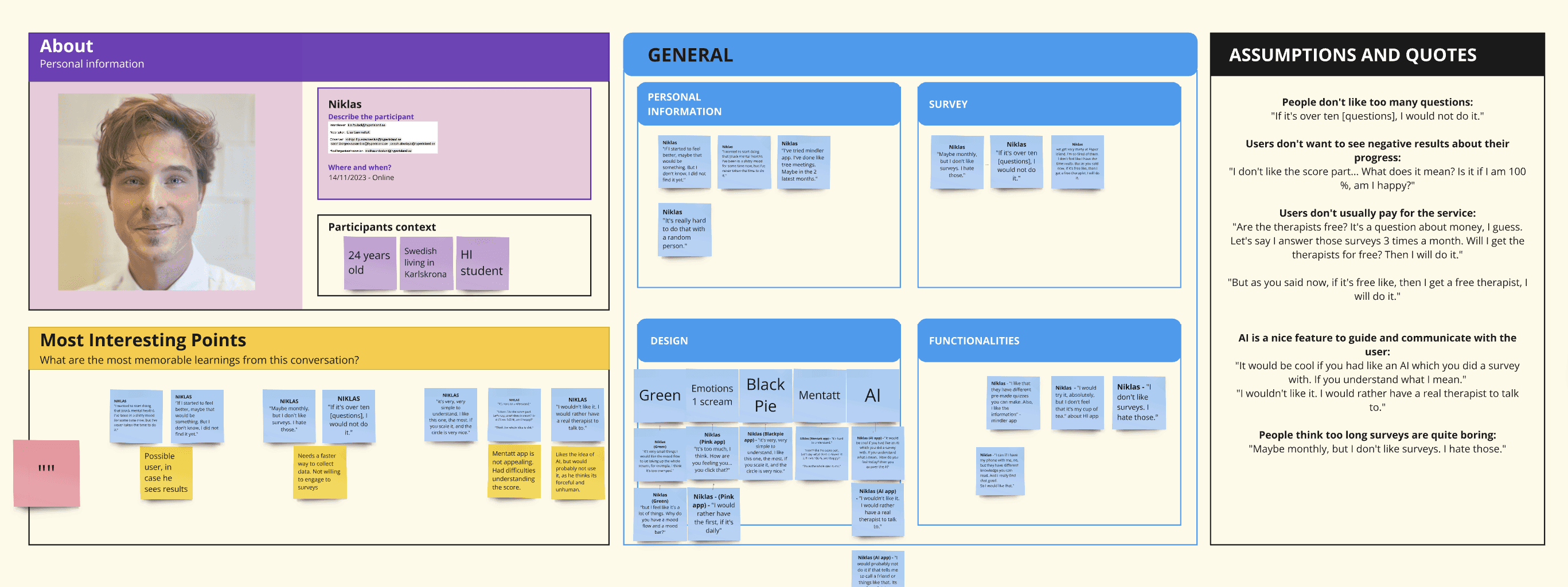
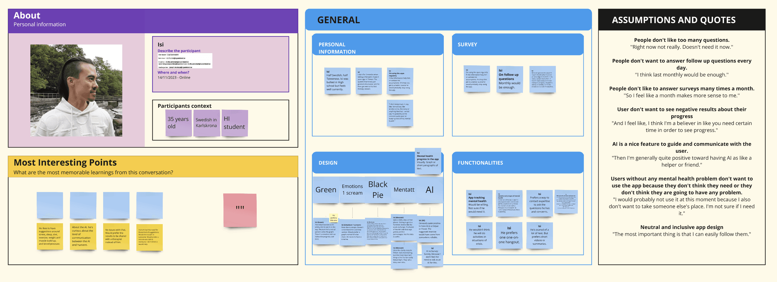
We gathered valuable data and took the time to cluster and analyze it. Based on this analysis, we came up with features and started designing the app accordingly, including how we show the results, the home page, and the surveys.
Data Analysis
User Flow
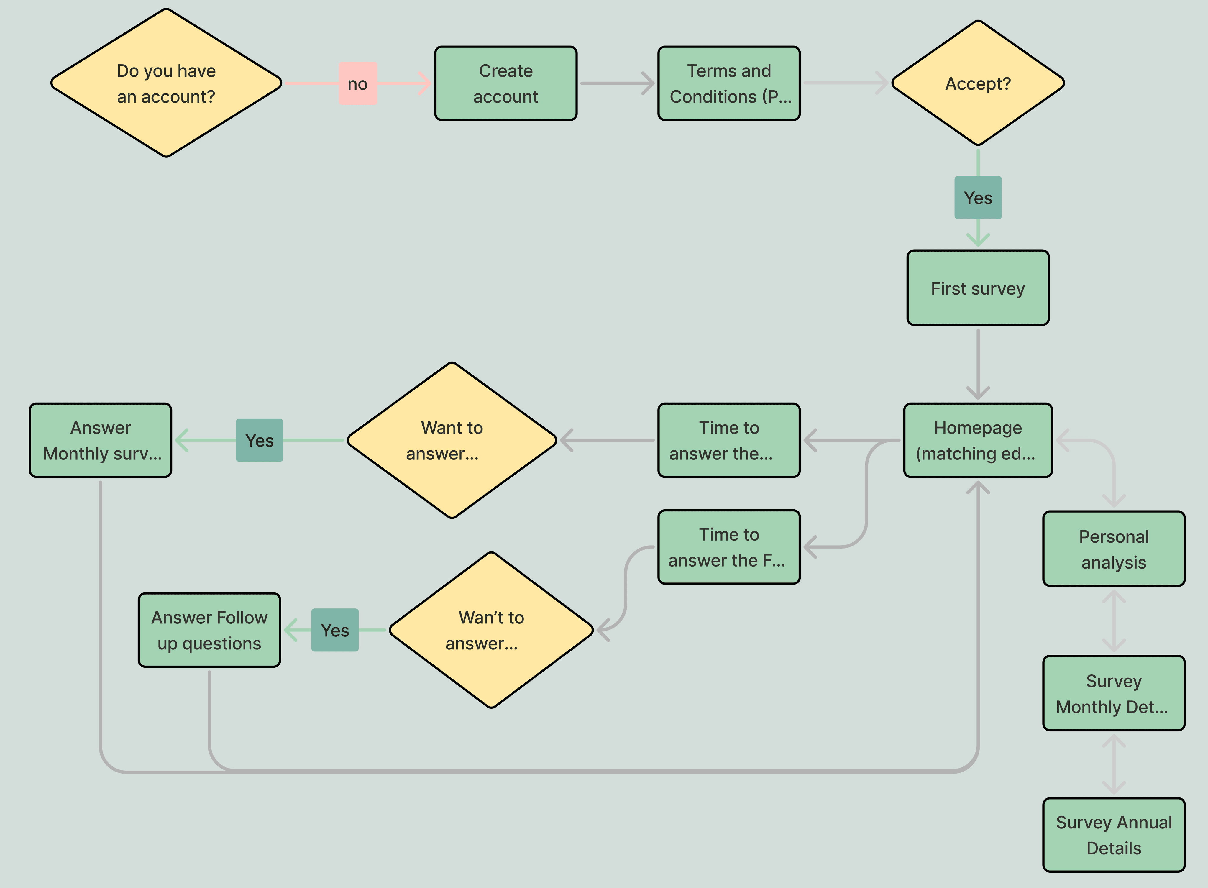
We then created a user flow to visualize how these features would be implemented and experienced by users.
WireFrames
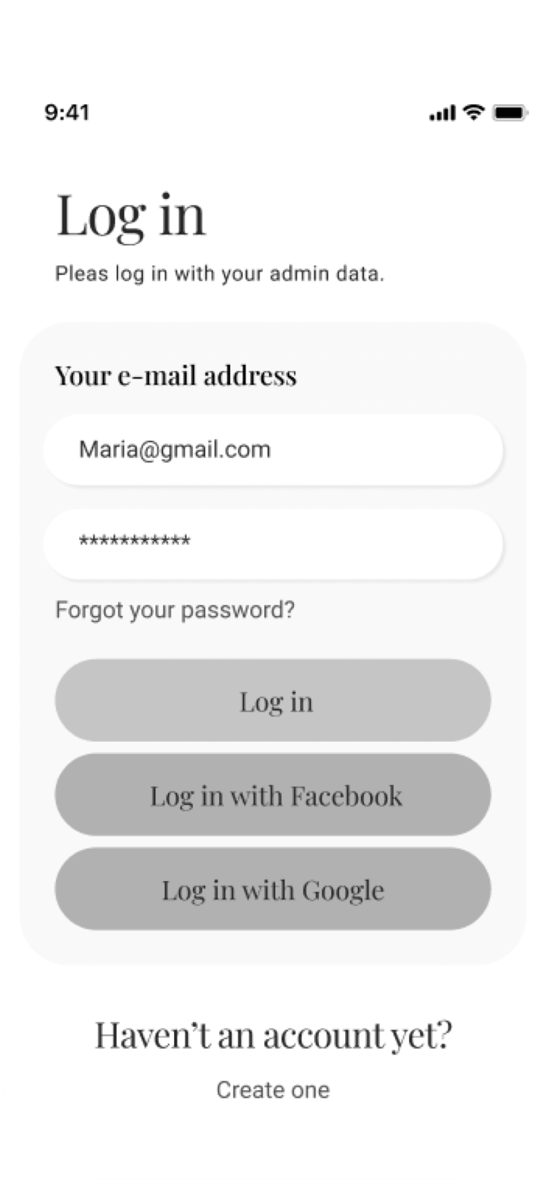
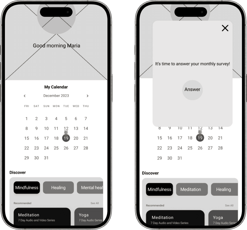
These wireframes served as the blueprint, outlining the user flow and interaction points. Before finalizing the design, we conducted user tests to evaluate functionality and ensure the app is easy to use and engaging. By testing these wireframes, we aimed to identify potential pain points and refine the user experience, ensuring our final design exceeds user expectations.



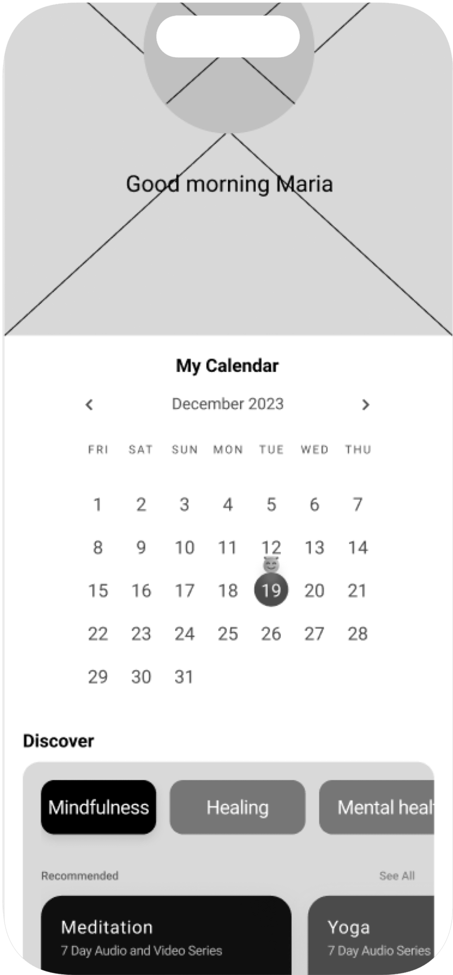

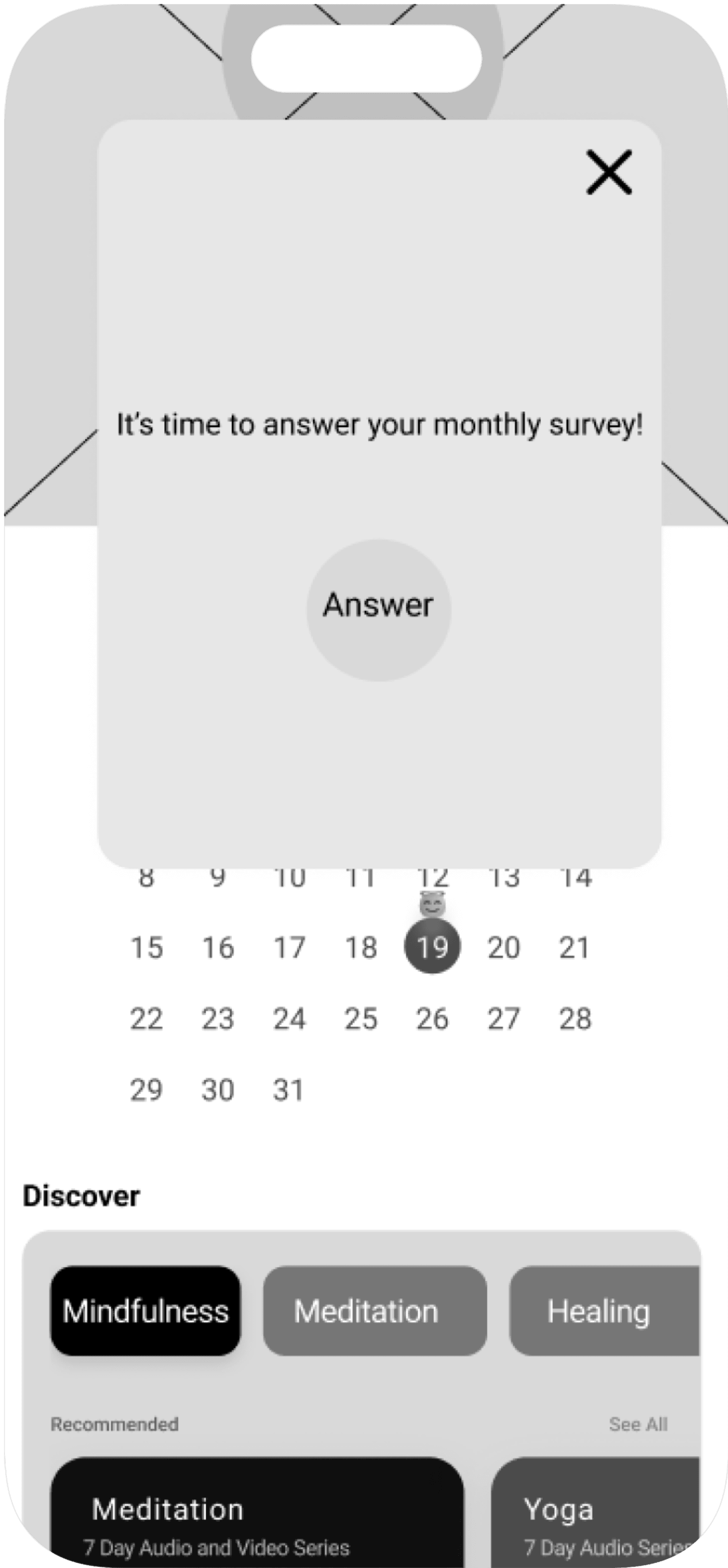




We learned that users felt having a calendar to track their emotions was not valuable. Therefore, we removed the calendar feature.
User Test
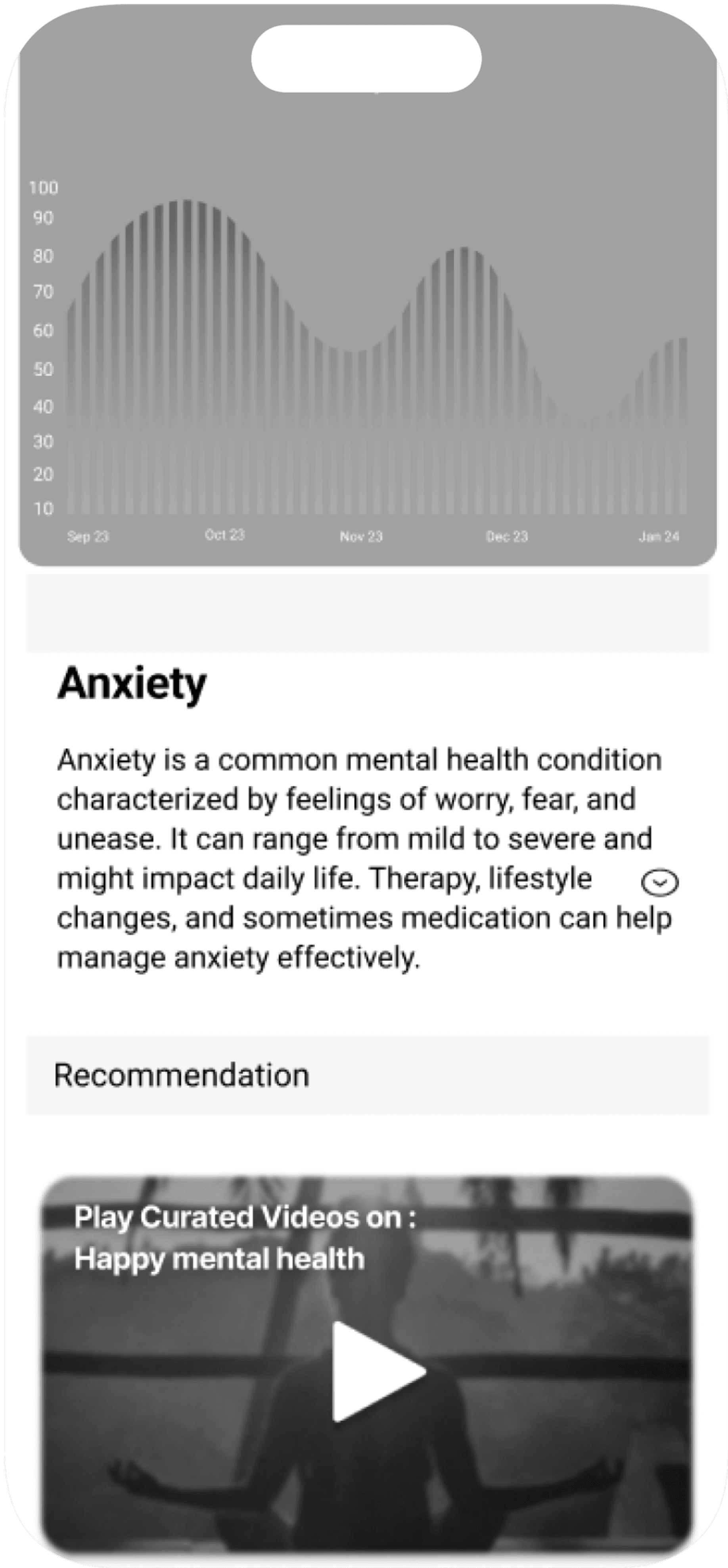
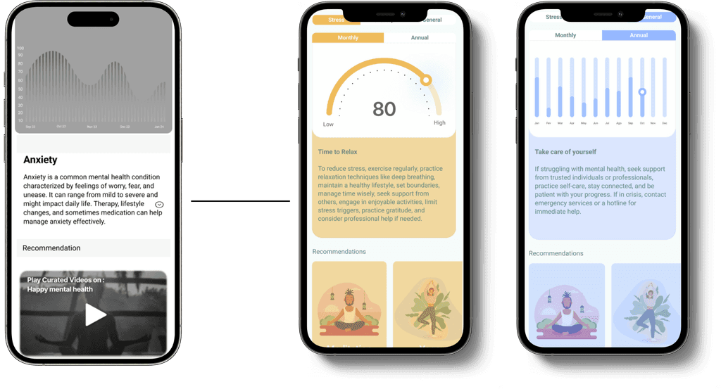
They prefer their mental health scores represented with both half pie charts and bar charts, finding this more understandable than just bars and numbers.
So, we decided to use colors and a combination of charts to represent different stages of mental health.
Primary
Secondary
Background
FDEBE9
DDE9FE
FFECC8
D9F3ED
9FE2D2
7FB5A8
5F887E
F5FCFA
ACB0AF
DCE3E1
626564
AaBb
Roboto
Typography & Colors
For our color palette, we chose shades of green as the base colors because green is associated with calmness, relaxation, and mental well-being. To represent the different stages of mental health, we decided to use three primary colors: pink, yellow, and blue. These colors are in pastel shades, which are known for their calming effect.
Prototype
After user testing and gathering all feedback, we began the final design and prototyping phase.




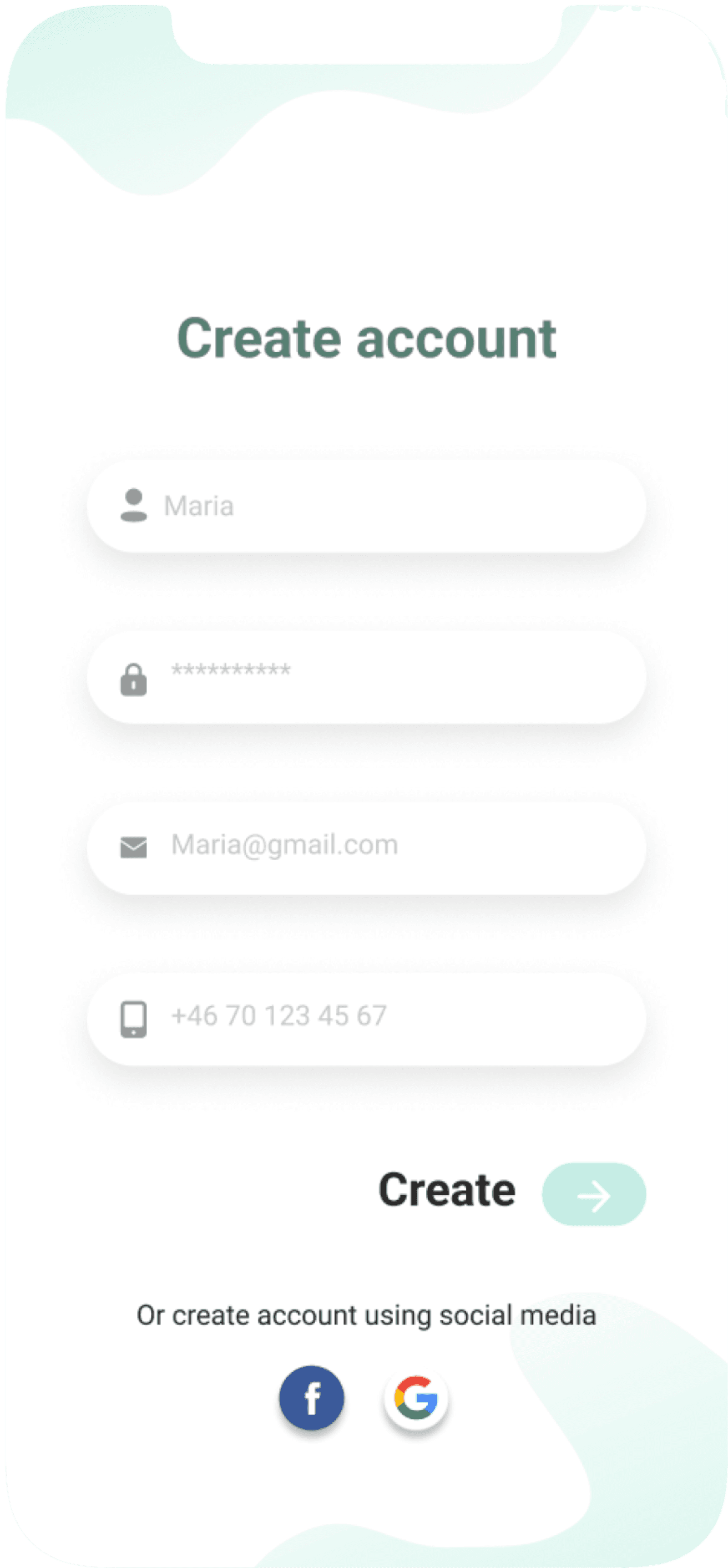


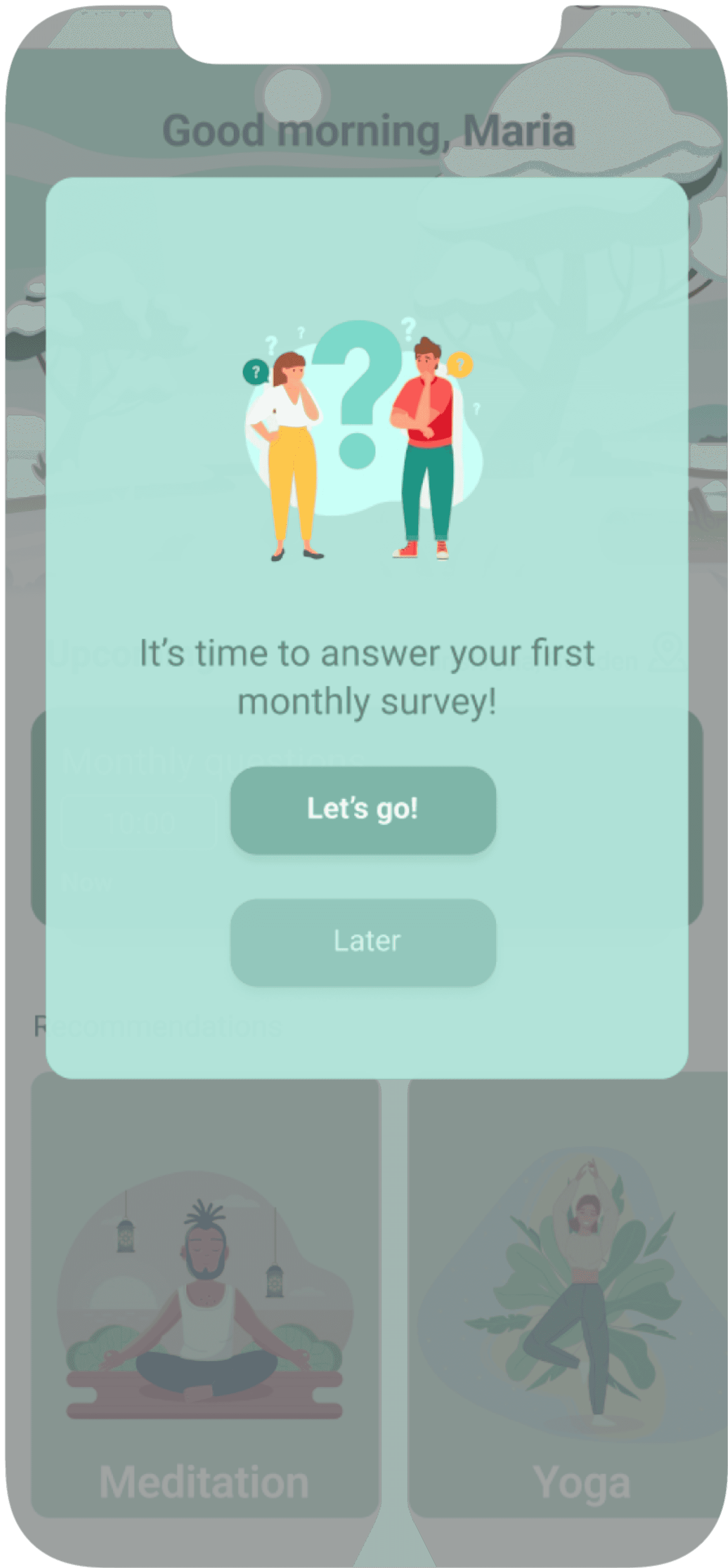


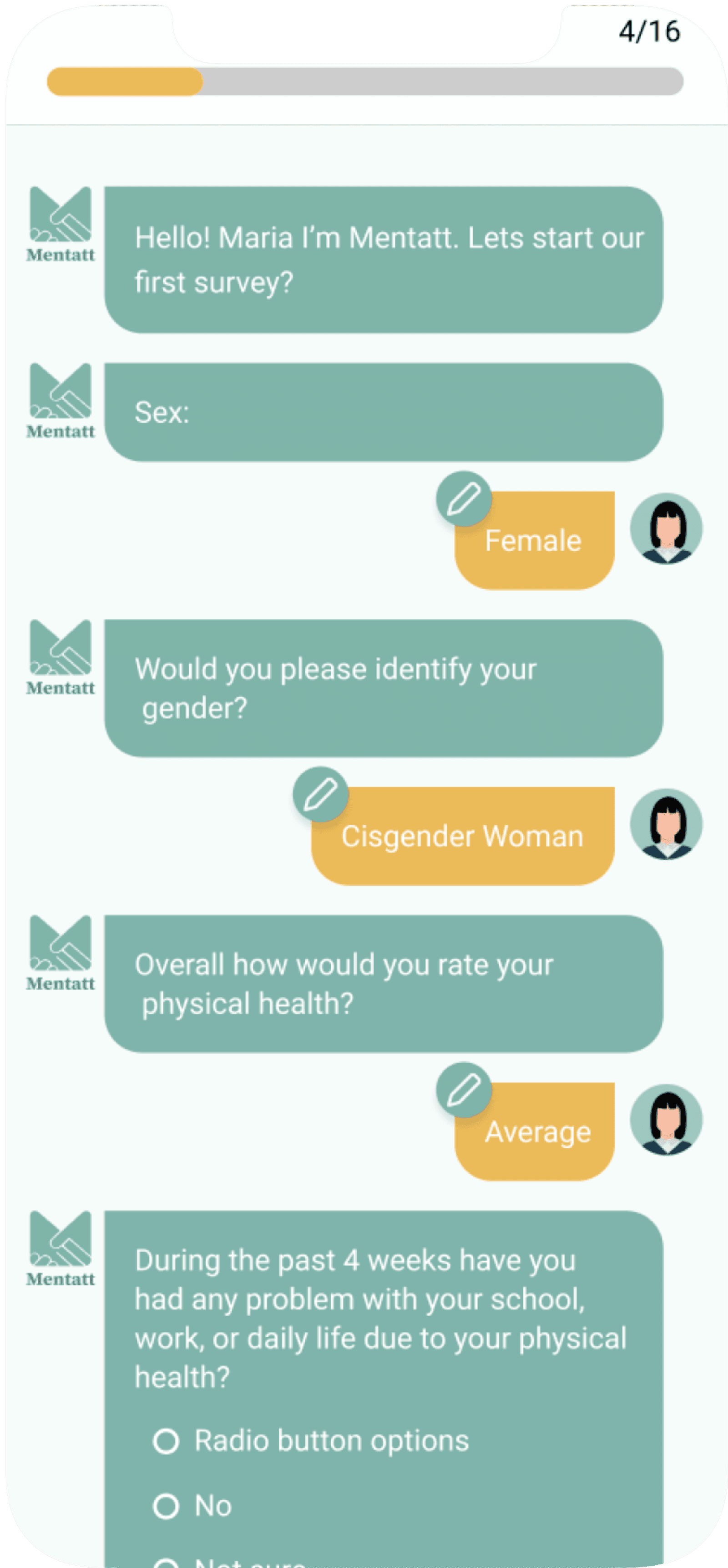
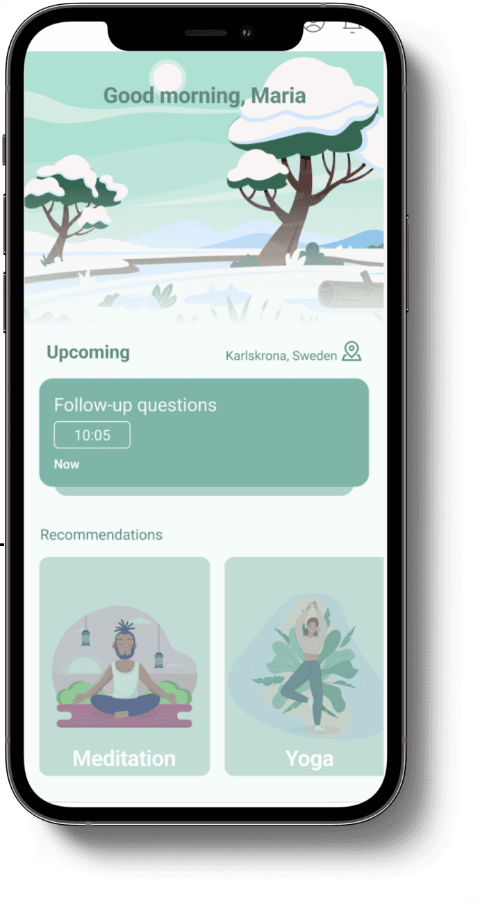












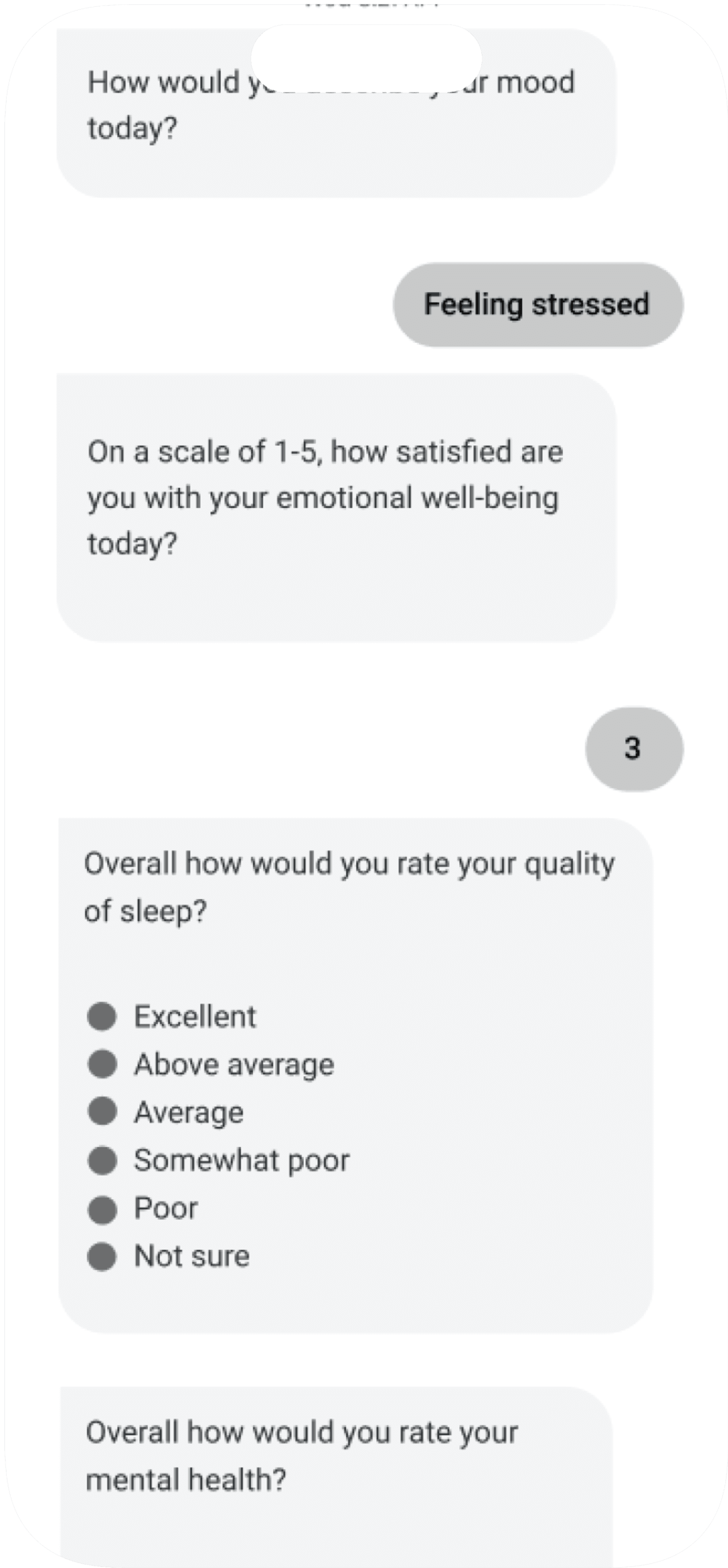
We made the monthly survey look like a chat, with up to 10 questions, to make it more engaging.
Final Design Screens
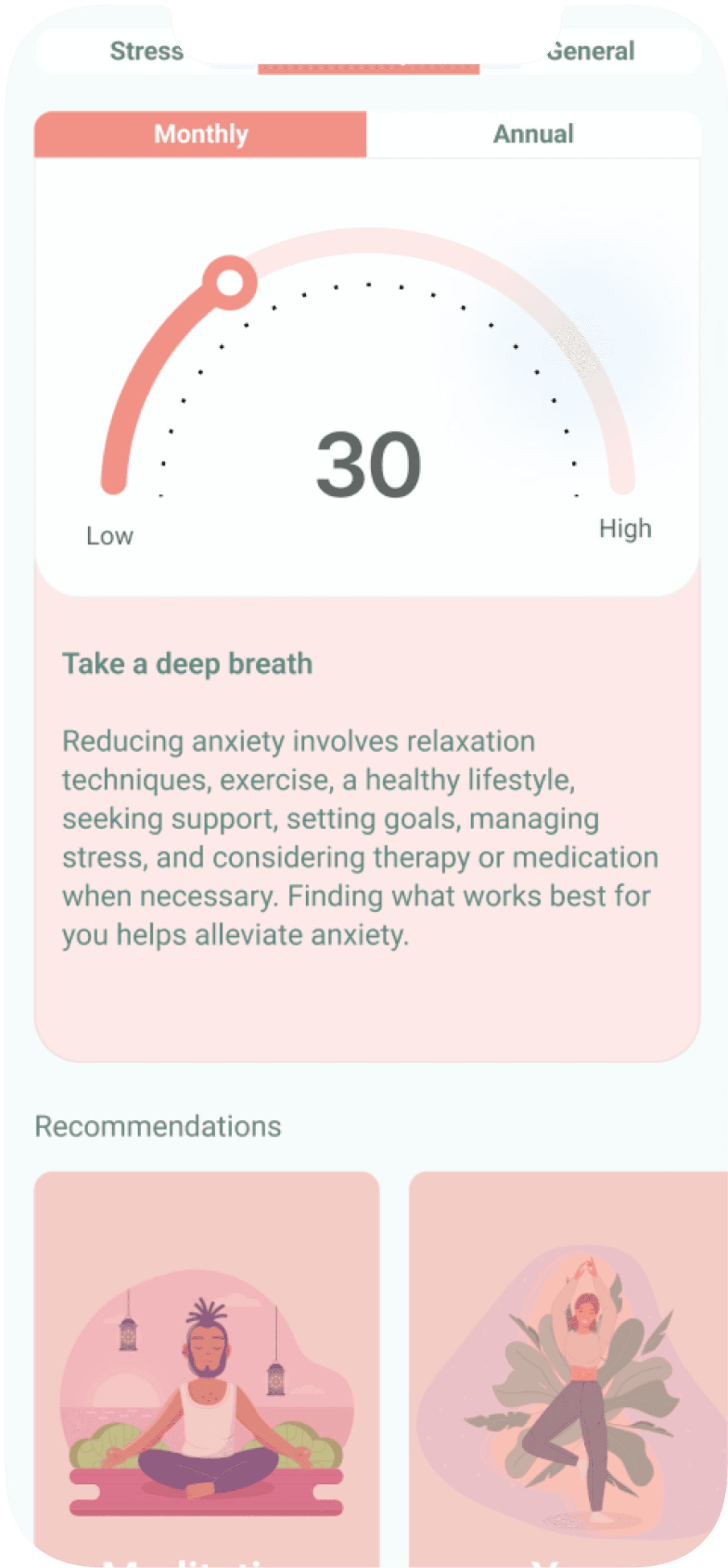
Recommendations for better mental health, which is the main goal of the business for students.
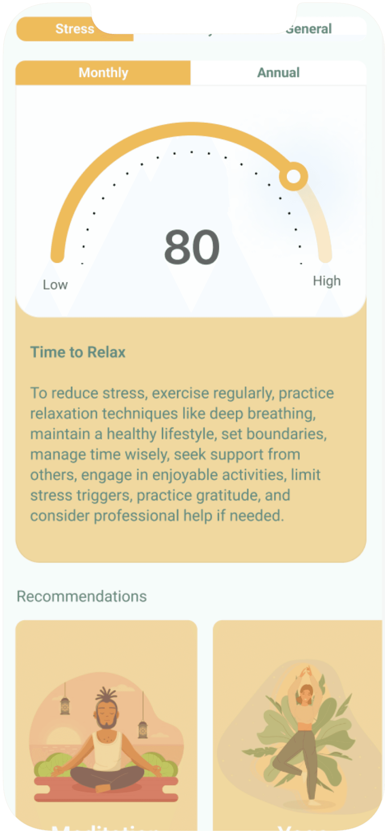
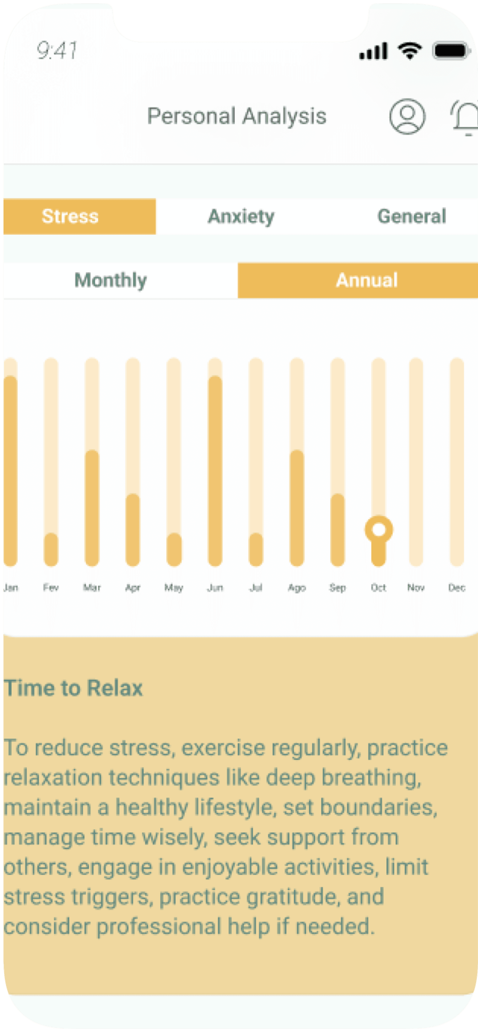
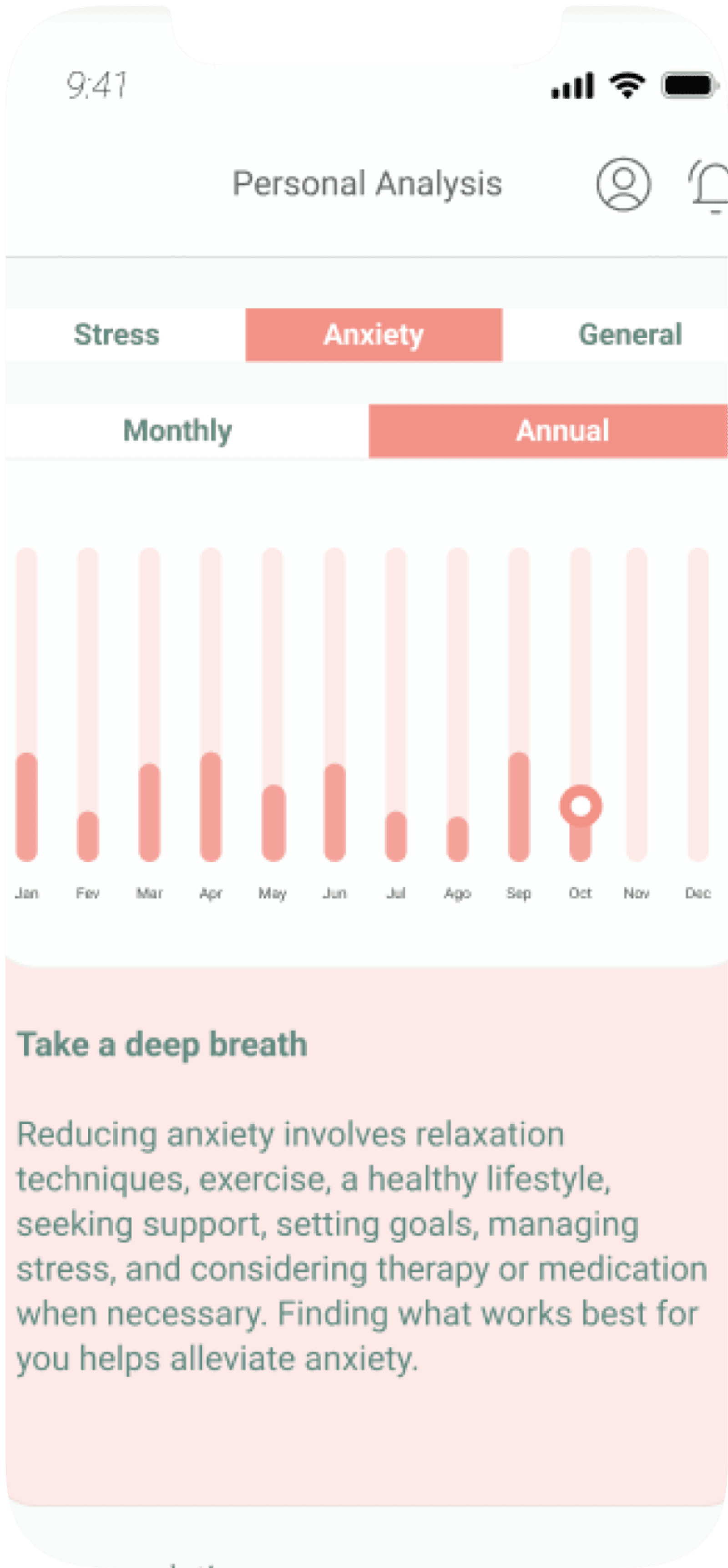
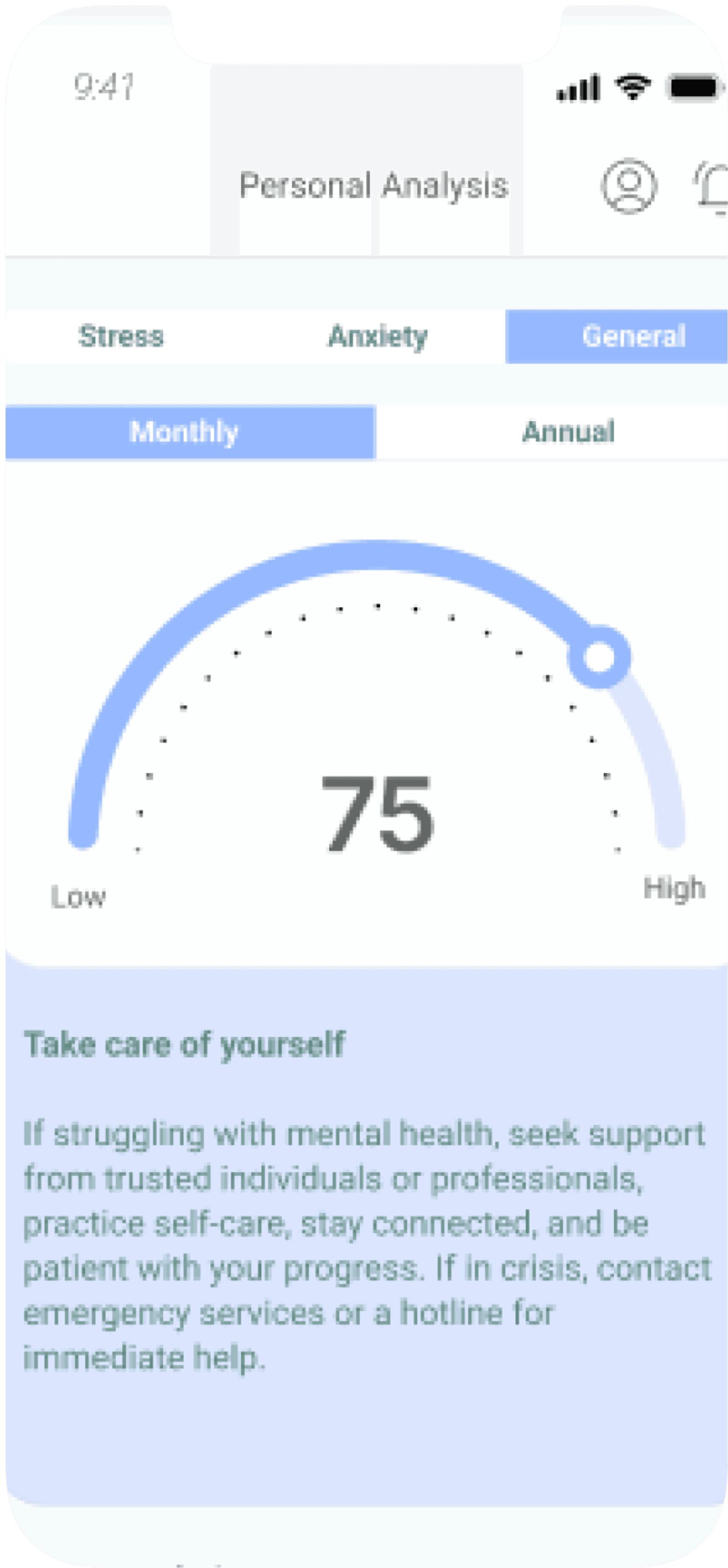
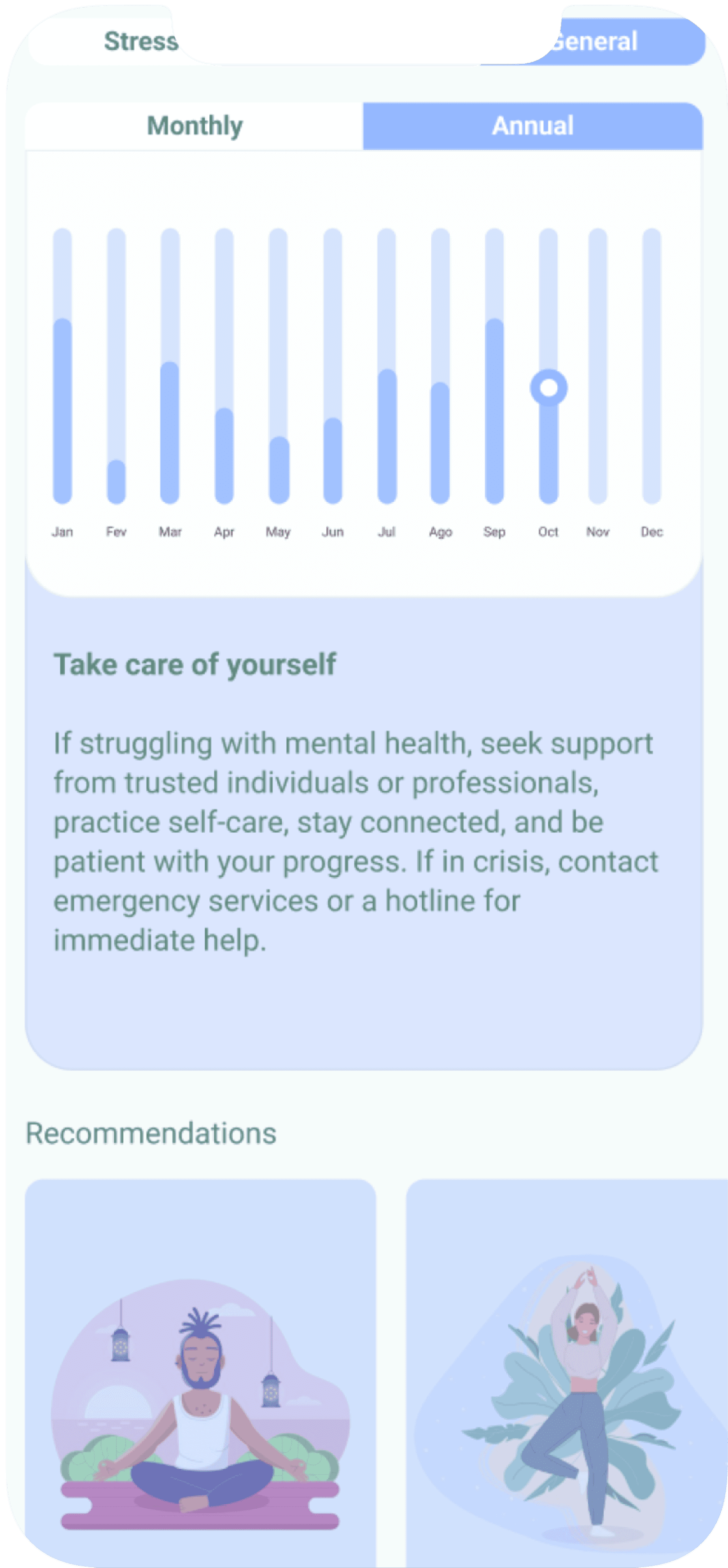
Users can see their results monthly and annually, allowing them to compare their mental health over time and determine if they have improved or need a therapist.
Based on their health stage, such as issues with anxiety or stress, the app uses colors and charts to make the information more appealing. Additionally, there is educational content and activities tailored to their health stage.
Most Interesting Lesson Learned
User preferences can vary significantly between interviews and practical tests. During interviews, users might express interest in certain features, but during user testing, they may find those same features not as valuable or engaging.
This taught me the importance of using multiple research methods, as relying solely on interviews can be misleading. Combining various techniques is essential to truly understand user needs and preferences.
